

What makes a good UI/UX skill
A UI/UX skill earns its place in an agent's toolkit by doing one of two things well: encoding a specific design system or tool workflow that the agent would otherwise improvise badly, or supplying a checklist and vocabulary that turns "make it look nice" into something checkable. The weak version of this category is a skill whose description says "creates beautiful interfaces" and leaves everything else to the model's judgment in the moment. That's not really a skill, it's a restated system prompt. The strong version bundles something concrete: a searchable database of styles and palettes, a hardened template, a scoring rubric, or a specific tool's API.
A few things worth checking before you install any skill in this category:
- Does it name what it produces? "Wireframe" outputs SVGs. "Design Critique" outputs a scored HTML report. A skill whose output format is unclear from its description is harder to verify once it runs.
- Does it require script execution? UI/UX work often leans on Python or Node.js to generate assets, validate output, or talk to a design tool's API. Check the
requiresfield on a skill's page before assuming it'll run on a platform without tool execution. - Is it tied to one tool? Penpot UI/UX Design and UX Theming are both excellent at what they do, but only if you're actually working in Penpot or building a VS Code theme. A tool-specific skill is a poor fit outside its target environment, however well it's written.
- Does it define what "good" looks like, or just what "different" looks like? A lot of anti-generic-design skills are good at breaking templated sameness but weaker at telling you when a design has gone too far in the other direction. Read the instructions, not just the tagline.
The ten skills below are ordered from broadest applicability to narrowest. The first few work on almost any frontend project regardless of stack or tool. The last few are excellent but only if you're using the specific tool or format they target.
The 10 best UI/UX skills for AI agents right now
UI/UX Pro Max
This is the broadest entry on the list: a searchable local database covering 84 styles, 192 color palettes, 74 font pairings, 192 product types, 98 UX guidelines, 104 icon entries, 16 GSAP motion presets and 25 chart types, spanning 22 stacks including React, Next.js, Vue, Svelte, SwiftUI, React Native, Flutter and plain HTML/CSS. It's built to sit underneath whatever framework you're already using, giving the agent priority-based recommendations instead of inventing a palette from scratch every time.
Who it's for: teams building UI across more than one stack who want consistent design decisions rather than a fresh improvisation per project. Caveat: the author is explicit that it's not suited to backend development, API design, or any task without a visual component. It's a design reference, not a general coding skill. It requires Python and shell access to query the database. From nextlevelbuilder/ui-ux-pro-max-skill (115,000 stars, MIT).
UI Styling
The implementation half of the same repository as UI/UX Pro Max above: shadcn/ui components (built on Radix UI and Tailwind), utility-first CSS, and canvas-based visual design, aimed squarely at React-based frameworks like Next.js, Vite and Remix. Where UI/UX Pro Max supplies the decisions, this one turns them into accessible, responsive components, dialogs, dropdowns, forms, tables, dark mode, theming.
Who it's for: teams already committed to shadcn/ui or Tailwind who want an agent that reaches for those primitives by default. Caveat: it's explicitly not a fit outside React or for teams using a non-utility-first CSS approach, pairing it with a different component library will fight the skill's assumptions. Requires Python, Node.js and shell access. From nextlevelbuilder/ui-ux-pro-max-skill (115,000 stars, MIT).
Penpot UI/UX Design
A comprehensive guide for producing professional UI/UX designs directly inside Penpot using MCP tools, design systems with components and tokens, dashboards, forms, navigation, landing pages, plus platform-specific guidance for iOS, Android and Material Design conventions. It also covers reviewing and improving existing Penpot files, not just creating new ones.
Who it's for: teams whose design workflow already lives in Penpot rather than Figma or Sketch. Caveat: the author notes this isn't suitable for anyone outside the Penpot environment, or for advanced design features Penpot itself doesn't support. It's a tool-specific skill, not a general design methodology. Requires Node.js and shell access. From github/awesome-copilot (38,000 stars, MIT).
Hallmark
An "anti-AI-slop" design skill built for greenfield pages, redesigns, audits, and pulling design direction from a URL or screenshot. It's built on principles from the anti-AI-slop design movement, with a defined process for inferring structural variety so that different projects actually look different from each other instead of converging on the same generic layout.
Who it's for: anyone building or redesigning a new app or landing page who's noticed that AI-generated interfaces tend to look interchangeable. Caveat: the author flags it as a poor fit if you want a highly flexible approach or a quick templated solution. It's opinionated by design, which is the point, but that means less room for creative improvisation. No script execution required. From nexu-io/open-design (85,000 stars, Apache-2.0).
Anti-Slop Frontend Skill
A narrower sibling to Hallmark from the same repository, focused specifically on landing pages, portfolios and redesigns. The agent reads the brief, infers a design direction, and produces real design systems where applicable rather than a one-off page, with an audit-first approach on redesign work and a strict pre-flight check before generating any code.
Who it's for: teams that mainly ship landing pages and portfolio sites and want a skill scoped tightly to that job. Caveat: the author is explicit that it's not suitable for dashboards, data tables, or multi-step product UIs, reach for Hallmark or UI/UX Pro Max instead for anything more structured than a marketing page. Requires Node.js. From nexu-io/open-design (85,000 stars, Apache-2.0).
Wireframe
Generates low-fidelity, black-and-white UI wireframes as standalone SVG files or viewer pages. It's deliberately stripped of color and branding so early conversations stay about layout and structure rather than aesthetics, with a strict set of guidelines that keep output consistent across sketches.
Who it's for: anyone who wants to iterate on a screen's structure with an agent before committing to visual design. Caveat: the author is clear this isn't for high-fidelity work, branding discussions, or anything requiring a specific color palette. It's a pre-design tool, and you'll want to hand off to something else once the layout is settled. Requires Node.js and shell access. From paperclipai/paperclip (76,000 stars, MIT).
Design Critique
Runs a five-dimension expert design review (Philosophy, Visual Hierarchy, Detail, Functionality, Innovation) on any HTML artifact in the project, each scored 0–10, and outputs a self-contained HTML report with a radar chart, evidence-backed scores, and three actionable lists: Keep, Fix, Quick-wins.
Who it's for: teams who want a second opinion on a design before shipping it, especially when comparing multiple variants. Caveat: it only works on HTML artifacts and isn't built for quick, low-effort feedback. It's a structured review tool, which means it takes longer than eyeballing a screenshot yourself. No script execution required. From nexu-io/open-design (85,000 stars, Apache-2.0).
Design Engineering
Encodes designer Emil Kowalski's philosophy on UI polish, component design, animation decisions and the invisible details that separate software that feels considered from software that merely functions. It's a reference skill rather than a generator, closer to a style guide for judgment calls than a tool that outputs assets.
Who it's for: teams refining an existing interface who want a consistent point of view on the small decisions, easing curves, spacing rhythm, when an animation adds clarity versus when it's just motion for its own sake. Caveat: the author notes it isn't a fit for rapid prototyping where aesthetic details aren't the priority yet. Apply it once structure is settled, not while you're still figuring out what the screen even needs to do. No script execution required. From nexu-io/open-design (85,000 stars, Apache-2.0).
UX Theming
Covers VS Code theming specifically: color token registration, CSS variable usage, widget styling patterns, and compliance with high-contrast and focus-indicator accessibility requirements for light, dark and high-contrast theme variants.
Who it's for: developers building or maintaining a VS Code theme or extension. Caveat: this is a genuinely narrow tool, useful if you're in the VS Code theming ecosystem, irrelevant otherwise. The accessibility guidance inside it (focus indicators, contrast ratios) is worth reading even if you never touch VS Code, but the skill itself won't activate outside that context. No script execution required. From microsoft/vscode (189,000 stars, MIT).
Power BI Report Visualization Designer
A structured design-consultation framework for Power BI reports: gathering requirements, analyzing data context, defining technical specifications, and guiding chart selection so the finished report communicates insight clearly rather than just displaying every available field.
Who it's for: anyone building Power BI dashboards who wants the agent to ask the right design questions before generating a report layout. Caveat: the author notes it's not built for users who want fully automated report generation without design input. It's a consultative process, not a one-shot generator, so expect it to ask questions rather than immediately produce a finished report. No script execution required. From github/awesome-copilot (38,000 stars, MIT).
How to install any of these skills
Every skill above is a plain folder with a SKILL.md file inside it. Nothing to license, nothing to register. The fastest way to install one is the cross-agent skills CLI, run once from your project root:
npx skills add nextlevelbuilder/ui-ux-pro-max-skill/ui-ux-pro-max --agent claude-code
Swap the path for any of the installCoordinate values listed on the skill pages above, and swap --agent claude-code for whichever agent you're installing into. The same command pattern works for Codex CLI, Cursor, Antigravity and the rest, only the target directory changes.
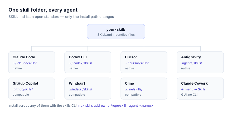
If you'd rather install by hand, clone or copy the skill folder into your agent's skills directory (~/.claude/skills/ for personal-scope Claude Code, .claude/skills/ for project scope) and start a new session. Full walkthroughs, including troubleshooting for skills that don't seem to activate, are in our guides on installing skills in Claude Code and installing skills in Codex CLI. If you're on Anthropic's agentic workspace instead of a coding CLI, see installing skills in Claude Cowork.
Whichever route you take, open the skill's source on GitHub first. Several of these bundle Python or Node scripts that run with whatever permissions your agent session has, reading the code before you run it is a five-minute habit that beats finding out the hard way what a script does.
Combining several of these into one workflow
These skills aren't mutually exclusive, and the strongest UI/UX setups usually chain two or three of them rather than relying on one. A few combinations worth trying:
- Wireframe → UI/UX Pro Max → Design Critique. Sketch the structure first without worrying about aesthetics, apply the design-decision database once layout is settled, then run a scored review before calling it done.
- UI/UX Pro Max + UI Styling. These are two halves of the same skill package for a reason. The first supplies the decisions, the second turns them into shadcn/ui components. Installing both gives you decision-making and implementation from one coherent source rather than two skills with conflicting opinions.
- Hallmark + Design Engineering. Hallmark handles structural variety so a new page doesn't look templated; Design Engineering governs the polish layer on top, spacing, animation, the details that separate "different" from "considered."
Not every combination is additive. Running Anti-Slop Frontend Skill and UI/UX Pro Max on the same greenfield build can produce conflicting instructions, since one is opinionated toward marketing-page conventions and the other is a broad multi-stack reference. Pick the one that matches the actual page type rather than stacking both.
Where these skills fit in the broader ecosystem
None of these are the only good UI/UX skills available. This is a curated selection based on how clearly each one names its output, how actively its source repository is maintained, and how broadly it applies, not a benchmark or a test result we ran ourselves. Browse the full, current list at the UI/UX category page, or the design category more broadly, and check all skills if you're after something more specific than what's covered here.
If you're new to the format itself, what agent skills are and the SKILL.md format explained are good starting points. And if none of these fit your exact workflow, writing your own is often faster than it looks. A design-system skill is usually just your existing style guide, restructured as instructions an agent can follow.
Turn the design brief into a published page
For a visual website-building workflow, follow our Claude and Framer landing-page guide. It covers the brief, mobile review and SEO checks before publishing.